Google Pixel Watch Review: I Don't Get It
Retail Price: $399
We are a participant in the Amazon Services LLC Associates Program, an affiliate advertising program designed to provide a means for us to earn fees and support our channel by linking to Amazon.com and affiliated sites.
Disclaimer: Google sent us a unit of the Pixel Watch free of charge to review, but all thoughts and opinions expressed in this review are our own and were not discussed with the company prior to publishing.
I’ve been seeing a lot of negative press about the Google Pixel Watch lately. Every time I flip through my feed, I see headlines and comments about how this watch is a total mess. I’ve worn the Pixel Watch on my wrist everyday since Google sent us a unit prior to launch and I can honestly say that I don’t get it. Just so we’re clear, I don’t get the negativity aimed at the watch as I think it’s absolutely terrific. So let's try to explore what the Pixel Watch actually is in correlation to where the Android smartwatch world was prior to its release.
Eye of the Beholder
As someone who was chastised for wearing a Pebble Watch in 2013, I’ve basically seen and worn just about every type of wearable time telling device you can fathom. I believe that the Pixel Watch is currently already the best smartwatch on Android. It isn’t perfect by any means, but there is nothing out there for Android quite like this.
I wrote an article earlier this year talking about my early smartwatch journey and why the Apple Watch has dominated the scene since then. At the time, the Pixel Watch still was just a long tenured rumor stuck in the mill. Whenever I was on Android over the last few years, either an Amazfit, Galaxy Watch or a Fossil Watch occupied the spot on my wrist. They all functioned in a way that was beneficial to me to keep around, but I never felt immersed with those watches in my day to day life. I talked in that article about how the Apple Watch was a perfect blend of many things that just worked and looked good while doing it. When I put that Pixel Watch on my wrist, I quickly began feeling some of those same vibes. I’m sure someone out there is thinking to themselves that I’m just brand stricken with the big two, however, there’s more to that than meets the eye when it comes to these products.
The Pixel Watch displays information cleanly and organized
Actually it’s exactly what the eye sees that is the first difference between the Pixel Watch and a lot of other watches for Android. One of the original core functions a smartwatch is useful for is to quickly glance at a notification or text message. The way a watch displays and has the user interact with those said messages is of high importance to me. As much as I love the one month battery life of watches like the Mobvoi TicWatch GTH or the Haylou RS4, reading any legible text is a major headache on those things that drove me to take them off. That’s a consistent trade-off for those types of watches.
When you move over to the field the Pixel competes with, watches like the Fossil Gen 5E and the Galaxy Watch that I reviewed in recent years, present information much more neatly than those aforementioned cheaper watches. However, the way the user interacts with that information still varies greatly on these more expensive watches. Back in the early days of the Gear Watches, Samsung introduced a rotating bezel that in theory could be competitive to the crown found on the Apple Watch and now the Pixel Watch. The Fossil Watch is more of a traditional smartwatch interaction, simply relying on a finger for navigating. While neither of those are terrible methods of using a smartwatch, I have always resonated towards scrolling with the crown.
Stolen Crown?
Apple has thoroughly convinced me over the years that this is the most effective manner of navigating information in an allotted small space. I’m terribly glad that Google blatantly copied the Apple Watch in this manner. There must have been some market research that led them to make this design choice. From my own anecdotal experience after spending equal amounts of years with the spinning bezel and a crown on my wrist, I found myself naturally at ease utilizing the crown’s navigation, whereas the spinning bezel settled into a secondary method behind my finger on the S2 and Galaxy Watch.
Interacting with the Watch is effortless
However, the crown on the Pixel Watch doesn’t feel anything like the one on the Apple Watches. There is a definite lack of premium touch to the material used for this crown. Every time I press into it there is a slight creaking noise that emits. I don’t find the reflective glossy nature of the crown to help the cause either as it only adds to the flimsy aura it exudes. Using the competitors as an example, the buttons on the Galaxy Watch have a nice solid texture on it. The crown on Apple Watches are usually matte and extraordinarily smooth to operate. The minute your finger scrolls on it, you feel as if you were using something well made. I sadly don’t have that impression with the button and crown on the Pixel Watch.
What I’m trying to explain is that while this watch doesn’t win in many categories against the competition, the actual experience of interacting with this type of gadget is better on this Pixel Watch than on any of the competitors that are capable of pairing with Android. It’s not lightyears better than other premium smartwatches like the Galaxy Watch, but to me it does make a big difference in how I feel about the watch that I wear.
Looks
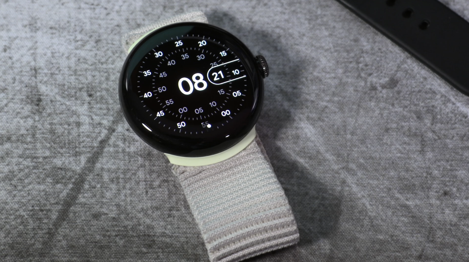
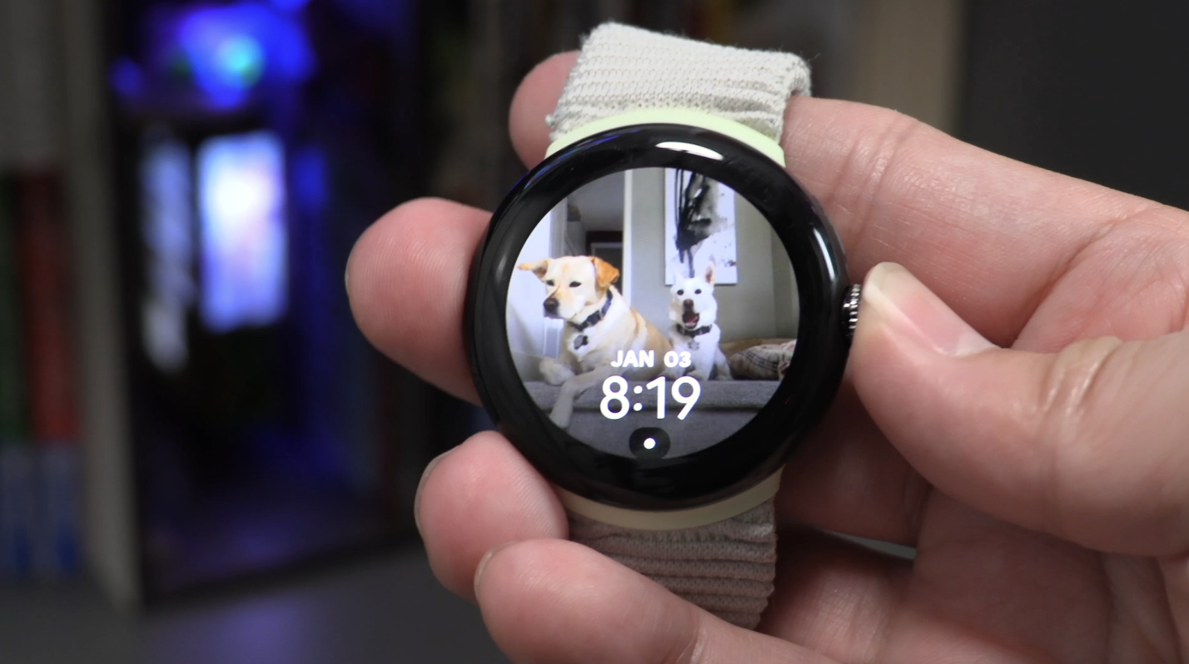
While we’re on the topic of the display, the 41 mm diameter is the single model that is offered by Google in their first foray into this new lineup. That means the AMOLED screen on my watch is the only size a Pixel Watch offers. It has a 320 ppi count that keeps text sharp enough to read at an arm's distance. I think the colors and saturation are pretty good for what it is. I can’t say that my eyes enjoyed looking at personal images as backgrounds more on the Pixel Watch than I did on the Apple Watch SE, but they’re also plenty acceptable from a palette standpoint here. The watch also gets moderately bright at max brightness. I never once had a difficult time viewing the watch face even with adaptive brightness managing it. I will give this watch praise as the AMOLED technology helps blend the black with the somewhat large bezels around the watchface. At first glance it’s hard to even notice it when using a black watch face.
The bezels didn’t bother me much as I did prefer the smaller footprint the Pixel Watch had on my wrist. If that’s what it took to keep the watch at this size instead of having an edge to edge display, I think it was the better choice. It is definitely one of the smaller frames that I’ve had on my wrist over the years. This is one of the reasons why I found the Pixel Watch to be exceedingly comfortable to wear. I paired it with an OEM Stretch Band and some days I don’t even feel the watch on me. This is something that has grown in the opposite direction for round Android watches. Watches have become larger and bulkier. Of course, this is all subjective to the wearer as many men like 44 mm and larger watches. I personally find a lot of versatility for customers of all sizes and gender with the smaller sized Apple Watches and now the Pixel Watch.
User Experience
The one thing I still don’t know if I like or dislike is the mechanism for the clasp that changes the watch bands. It requires users to kind of learn the little trick it takes to rotate in order to get it working. The first 5 minutes were truly frustrating for me. Once you get the handle of it, the method does feel a little neat to pull off. However, I don’t think this is something that was necessary. There’s no need to reinvent the wheel. Sure, Apple patented a great way to change bands, but the pin method on every other watch works perfectly fine. By making another proprietary method, watch wearers now have to purchase brand new straps with that proprietary mechanism. If it was a truly better and more efficient way of changing the bands, then I would be all for it. Months later, I still don’t see it and would have preferred the more traditional method.
I don’t gravitate towards the smooth glass appearance that falls off like a waterfall on the display. I’m a bit of a traditionalist and a Seamaster admirer, so having some sort of physical bezel on a round watch face is more attractive in appearance to me. I get why Google simply followed the Apple Watch playbook and just threw a round screen on top of a frame, but a square watch can get away with that look a bit easier. This is where I feel Samsung, through their many generations of tinkering with their bezel, and an actual watch company like Fossil, have a better understanding of round watch design.
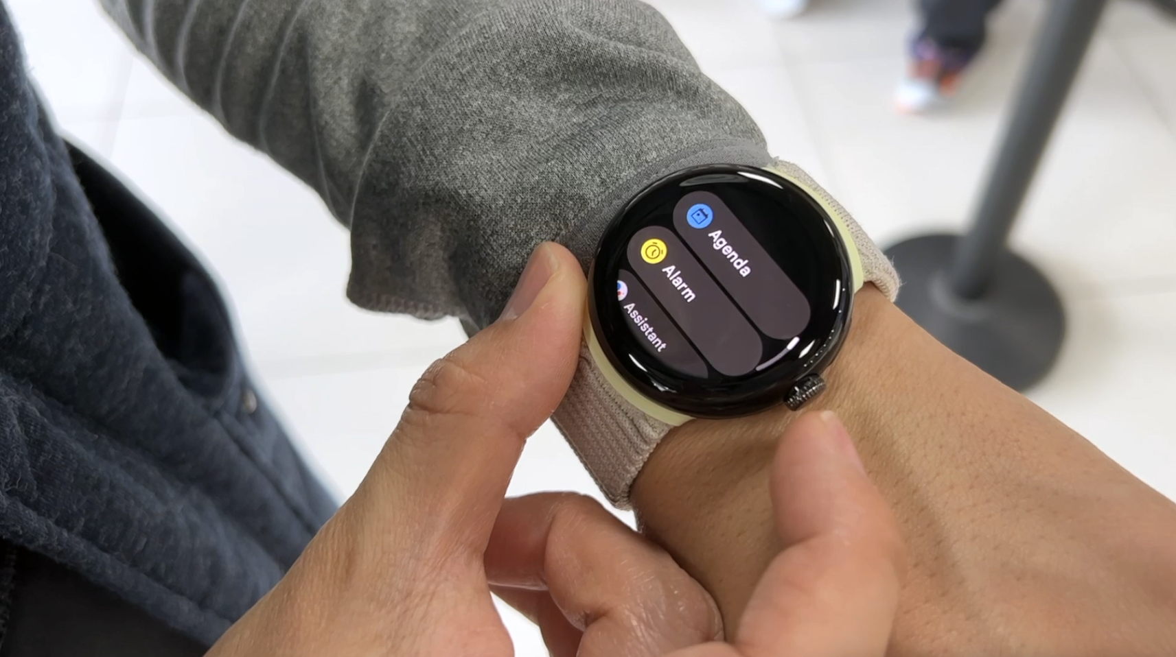
I do notice things that the Pixel Watch can learn to improve on from its competitors. We have access to the Play Store for apps, but the way we interact with the apps on WearOS is pretty terrible. You click on the crown and you literally have a list that you scroll down. That is a painful way of going through the apps you want to find. Apple and Samsung don’t have it down perfectly either, but the app icon bubble method those two brands employ is much more aesthetically pleasing and I would daresay easier to interact with as well. In day to day use, I was able to locate and open up apps I was looking for quicker on the Apple and Samsung watches than I was on the Pixel Watch. Alphabetical order keeps things from getting messy, but isn’t overly effective if you want to search for an app like Spotify which is lower towards the list order. If you use a specific app often you can hit the button above the crown for recent apps, but that’s not a fundamental excuse for the overall user experience with controlling applications.
Battery Life
The Pixel Watch is also missing some features that we’ve grown accustomed to over the years on other smartwatches. This is more notable the more premium your smartwatch experience has been in the past. If you’re looking for straight up spec value, then the Pixel Watch isn’t the right product for you. This carries over to some of the fitness tracking abilities as well. That’s a little ironic to say as Google now owns Fitbit and utilizes the Fitbit resources for the Pixel Watch’s health functions. I am not someone who sleeps with their watch on at night. However, I did test out every aspect of the watch including ECG and sleep tracking as many users do actually monitor the quality of their sleep now. It didn’t do too well with sleep tracking. There would be pockets of time that it would lose track of information. The heart rate tracking as you would expect measured perfectly in line with other watches.
On the other hand, since I don’t track my sleep in my daily usage, my watch settles onto my nightstand where the magnetic charging cradle sits. I actually have gone through a good battery life experience with the Pixel Watch using an always-on display tethered to my phone. While I never really relied on my wearables as a fitness tool, instead focusing more on a business utilization usage, your mileage may vary depending on what your lifestyle resembles.
Strapping it onto my wrist at 9 am and taking it off around midnight, the battery routinely drops to about 50% before coming back onto the charger. Fundamentally that gives me a day and a half of battery life. That’s in the comparable ballpark to other smartwatches I would categorize this thing to compete with. Until the day some OEM out there fuses the longevity of a fitness tracker like the Amazfits with the user experience of a smartwatch, we have to live with the compromises of both formats. For my daily life, this battery is more than suitable.
Software
I do think the WearOS 3.5 experience on the Pixel Watch is a huge improvement over where the platform was a few years ago. I was complaining about how clunky navigating the OS felt as recently was 2020. I did not feel that way here with the Pixel Watch at all. In fact, there’s only minor changes I would like to see tinkered with for the next software version. That’s a great sign for Google as software has been a huge lacking point of emphasis for the company. While Apple has continued to refine WatchOS, WearOS has been essentially dormant in tactful functionality development. Pairing the watch to Android phones was also extremely simple. I’ve matched the Pixel Watch with the Pixel 7 Pro, Asus Zenfone 9, and the Nothing Phone (1) and the connection process has been near instant. It’s Apple Watch-esque.
On the flip side of that, I did come across a bevy of software bugs. They were resolved relatively easily, but I can see how that would be frustrating for less tech savvy owners. One specific case I had was an app consistently force loading without touch. It required a few soft resets to finally get the watch to clear it out. I was also locked out of my watch during the setup process as the pin input would constantly freeze up as it asked me for my information. That required a hard reset and took me a bit of Googling to figure out how to do when on a frozen screen. I don’t think any of that has to do with the Exynos 9110 chipset more than it being just straight up software kinks. I feel that way because eventhough the Fossil Watch with the SD Wear 3100 chipset didn’t have lag issues, it did feel slower in responding to my input. I had none of that here on the Pixel Watch. All my swiping and commands felt instant. It’s a smooth experience all around.
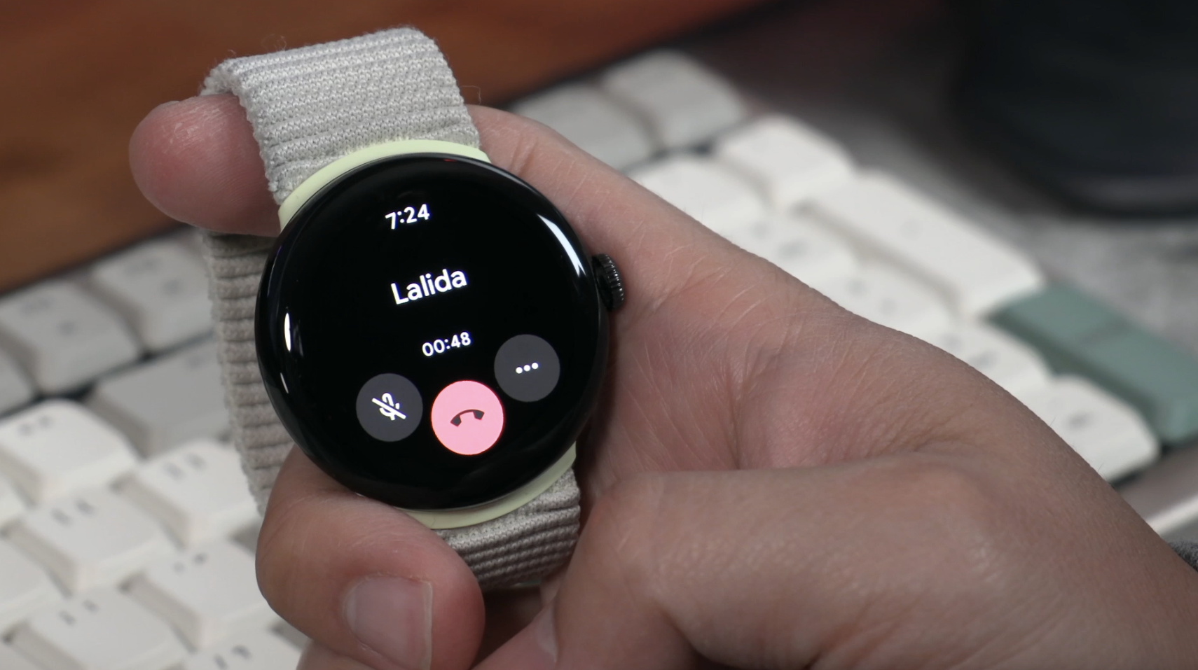
The last thing I found to be lacking is the speaker on the Pixel Watch. It’s so terrible in projection quality that it’s nearly unusable.
Final Thoughts
I glance at notifications at least 50-100 times a day and the Pixel Watch delivers that information to me in the best presentation I can find on Android. That’s a big selling point for me. It may not be for others.
Is the Pixel Watch perfect? Absolutely not. But it does the things I use a smartwatch to do in a clean and user-friendly manner. I glance at notifications at least 50-100 times a day and the Pixel Watch delivers that information to me in the best presentation I can find on Android. That’s a big selling point for me. It may not be for others. I use GPay just about daily with this watch and I do love the haptic feedback I receive from this watch. Once again, I personally don’t feel it’s at an Apple Watch level of experience, but it’s one of the better ones I’ve used on an Android compatible watch.
I keep saying that over and over in this review. That is essentially what the Pixel Watch is to me. It’s not as good as an Apple Watch experience, but it’s the closest to it we have on Android. It’s a good overall package that handles just about everything I want in a smartwatch cleanly and efficiently. To me that is something I have been salivating for years now.
Literally.
You can go back to some of my reviews from 2016-2018 where I sound like a broken record searching for the perfect Pebble Time replacement on Android. That journey has taken me through a lot of different watches and fitness trackers over the years, but for now, I’m actually quite content with the Pixel Watch. I’ll be extremely excited to see the improvements for the second iteration when it comes.


Alex
Caught in between the conundrum of his fascination with retro and the future, Alex has a very unique taste in technology. Never one to follow trends like his millennial peers yet constantly desiring to get ahead of the curve, he sees technology like he does his other love: comic books. Always looking for the best value or a hidden gem, his collector mindset reflects on some of his favorite gadgets: the Moto X (2015), HTC U11 and the Google Pixelbook. If there’s a good tech deal out there, Alex is on the hunt!